Master Lock
“The Luxury Lock”
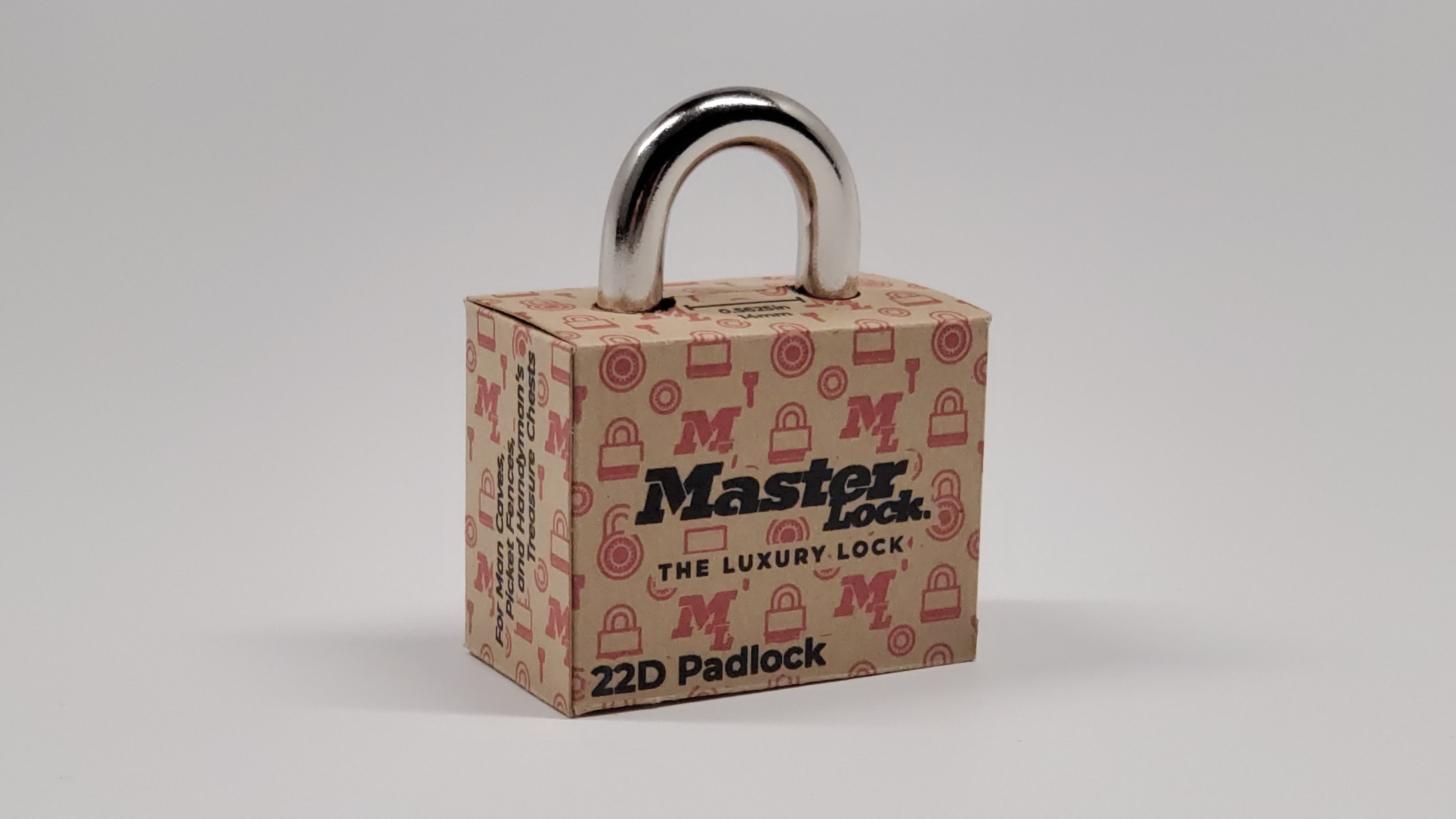
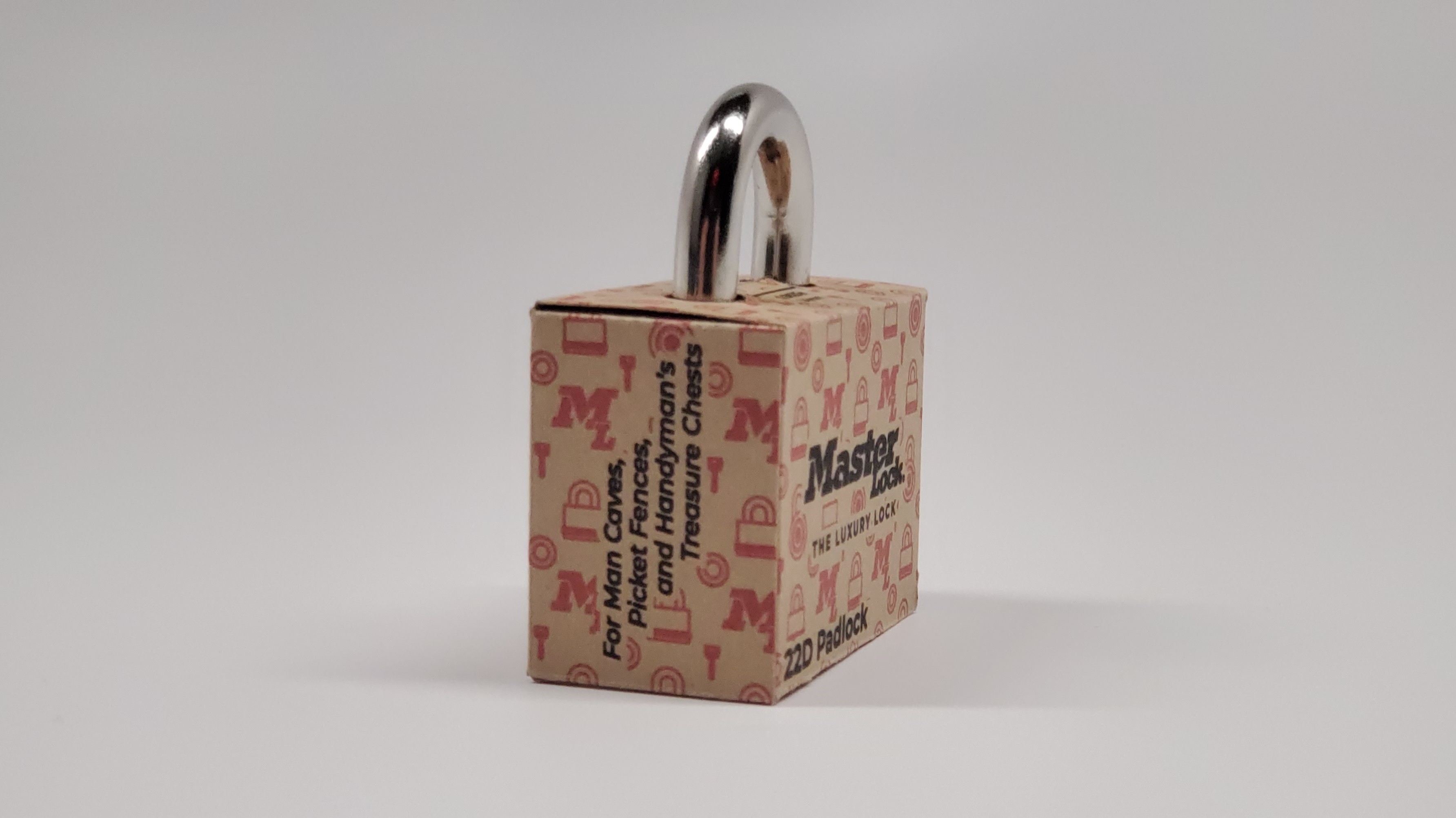
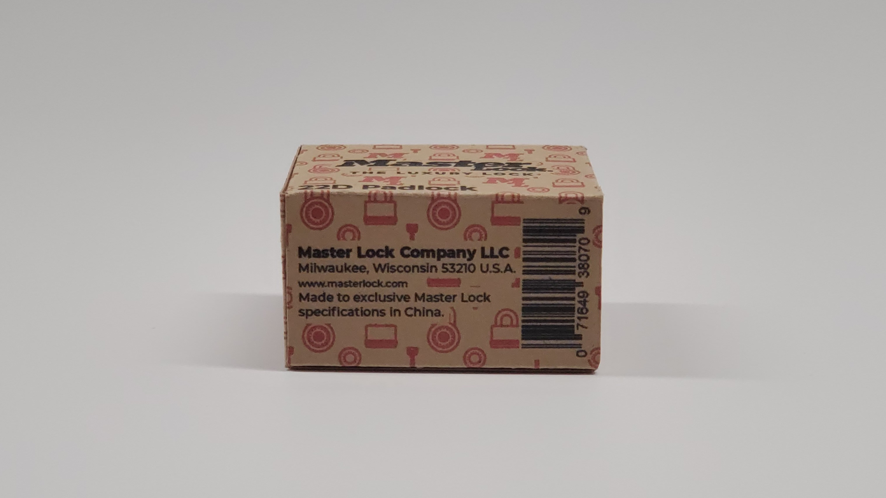
This project was originally created as a final project for my Production Design class. The objective behind this project was to take a product that used a lot of plastic and other non-sustainable materials in its packaging and redesign it with sustainability in mind. I chose a Master Lock padlock to redesign as the packaging it comes in is made entirely of plastic with a thin sheet of cardboard for the visuals on the packaging. After the redesign, I ended up with a very small box made out of recycled paperboard. The pattern used on the packaging was inspired by the famous Louis Vuitton pattern but using some of the iconography of Master Lock. I believe this project was a major success and is one of the best I’ve made as a designer.
Concept Sketches
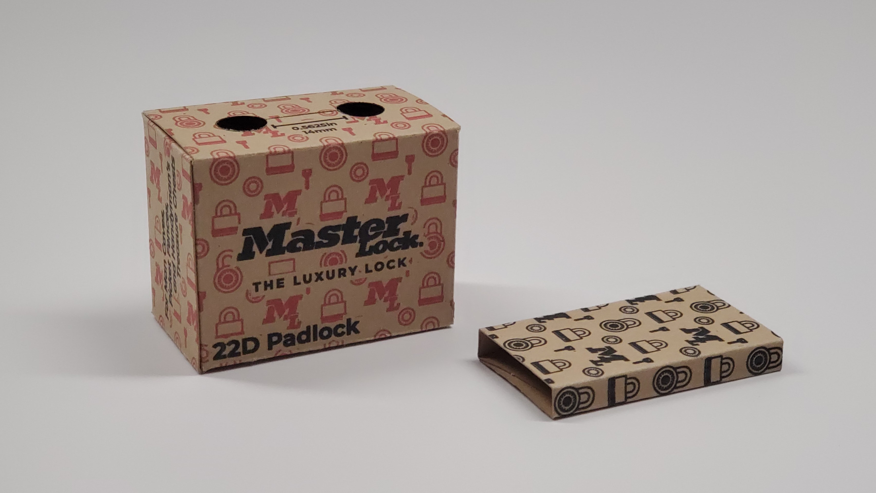
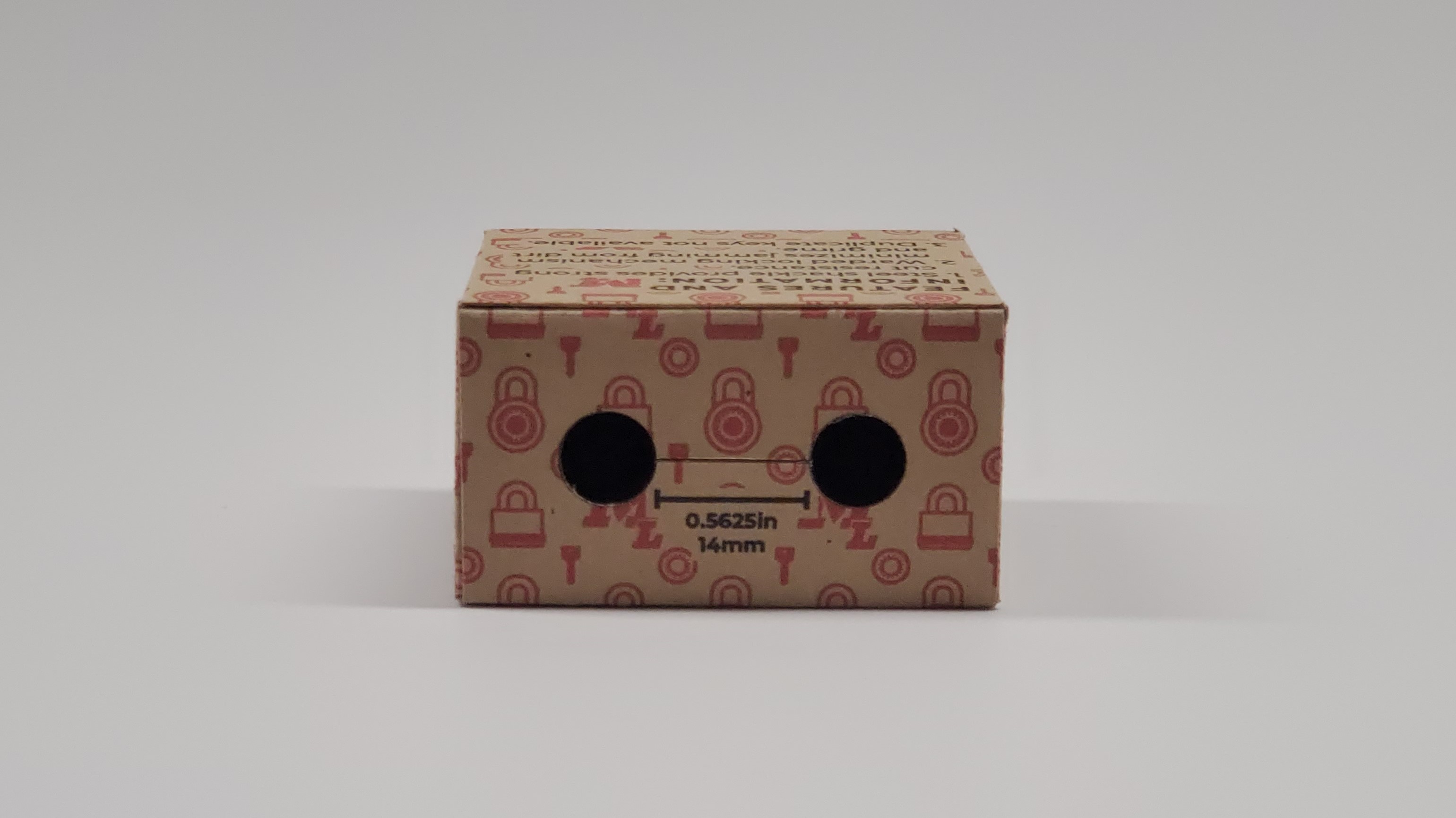
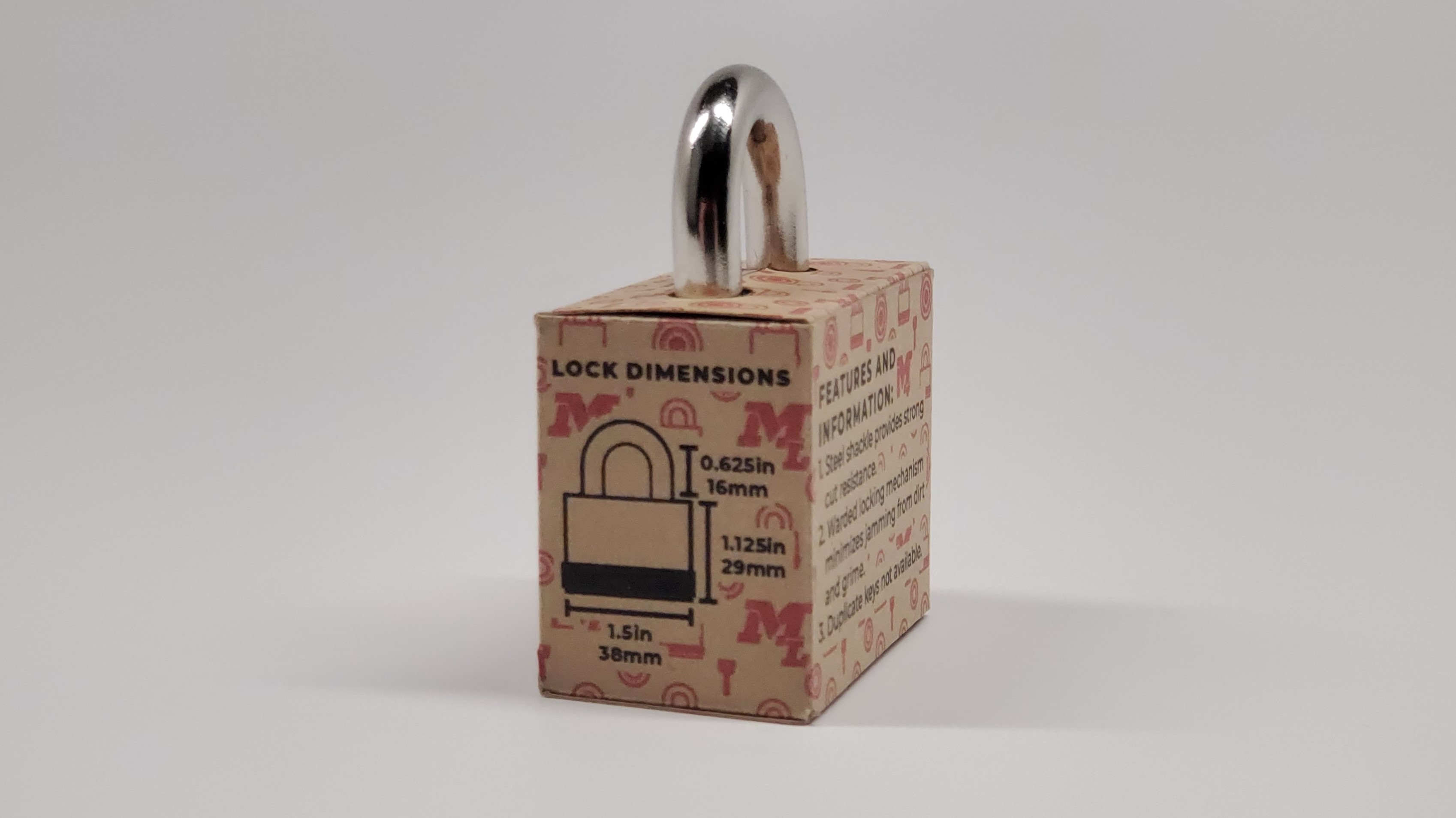
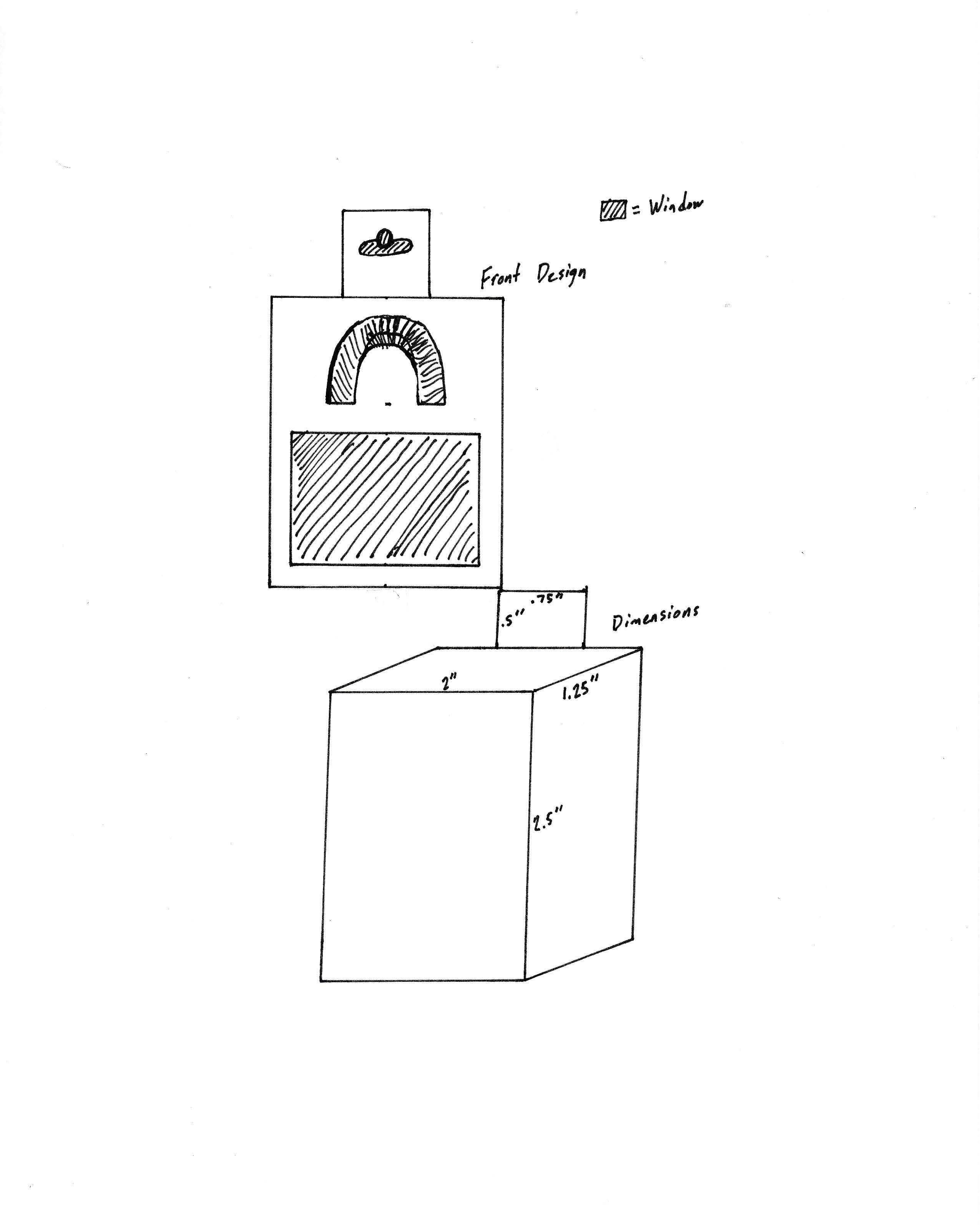
The first step of this project was to come up with a few different concepts for the packaging. After a significant amount of ideation, I narrowed my ideas down to these 3 concepts and sketched them out. The first concept would contain the entire lock with a window on the front side of the box to showcase the lock. This concept was a decent idea but the structure of the box was flimsy due to the window and the materials used. The second concept would be a narrow pocket that contained the keys and wrapped around the shackle. This was another decent idea but was deemed impractical due to the minimal space available in this type of packaging. The third and final concept would utilize the shackle as the hanger and have a sleeve that would hold the keys in the box. This was the most successful concept and the one I moved forward with as the packaging would be sturdy, innovative, and reusable.
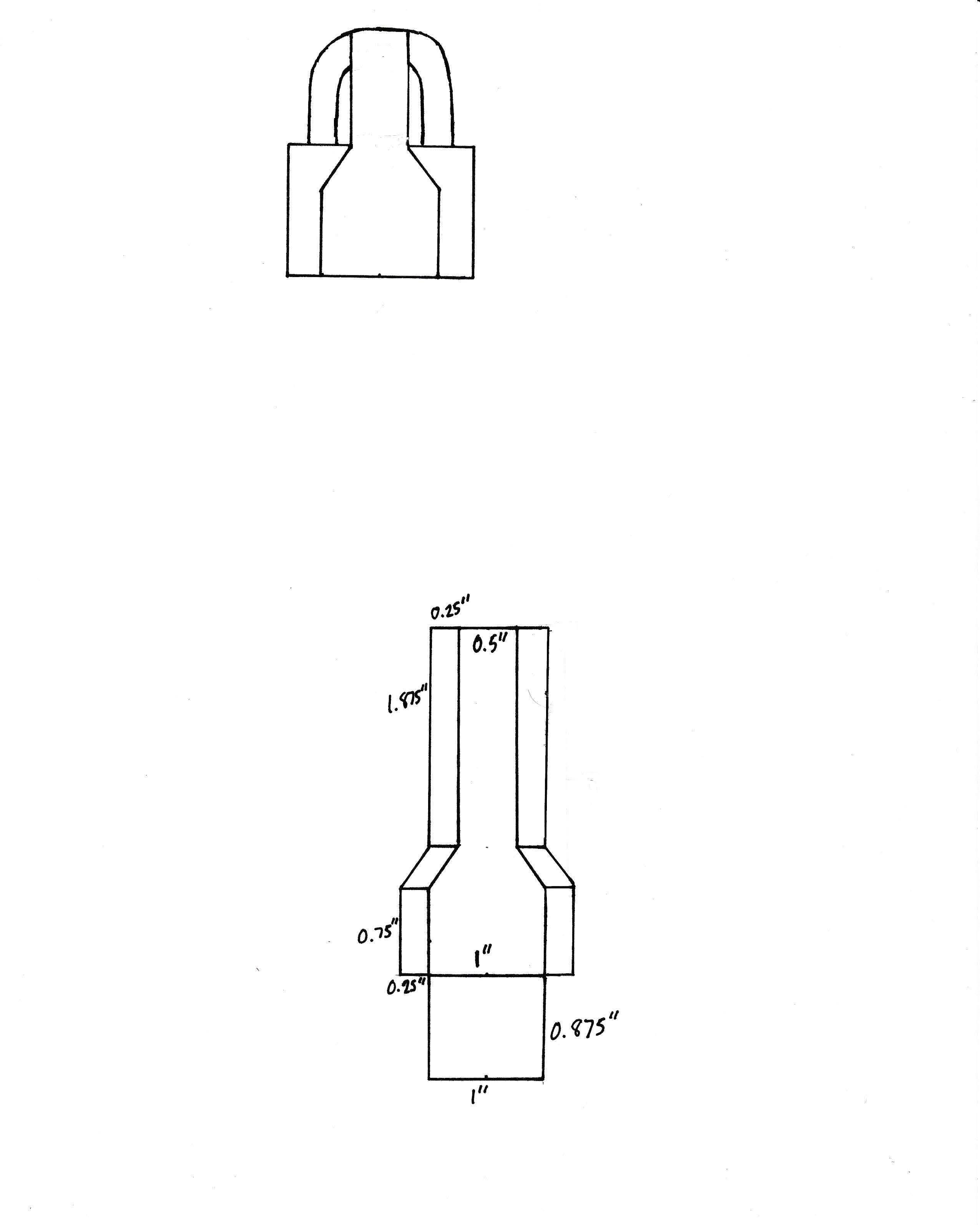
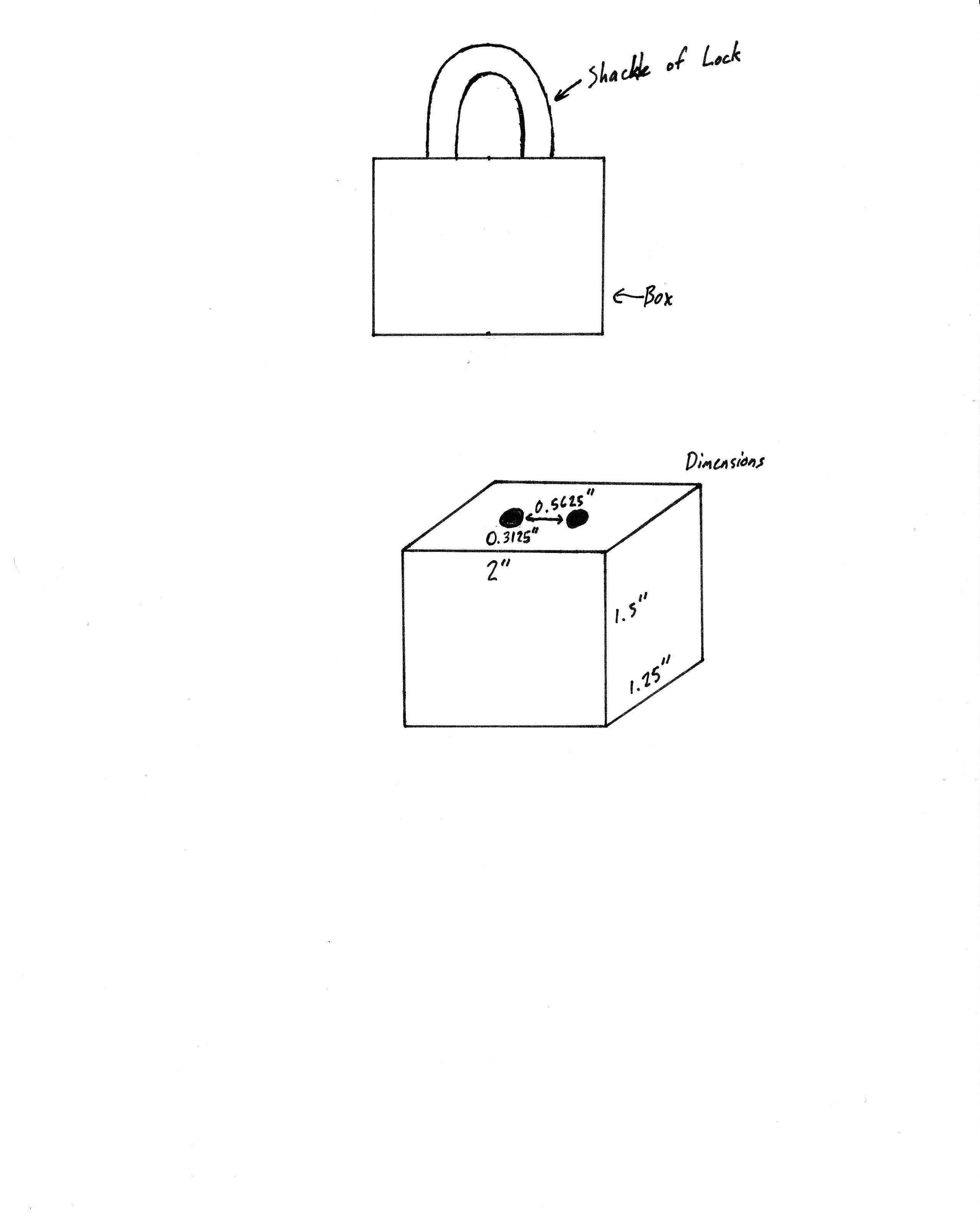
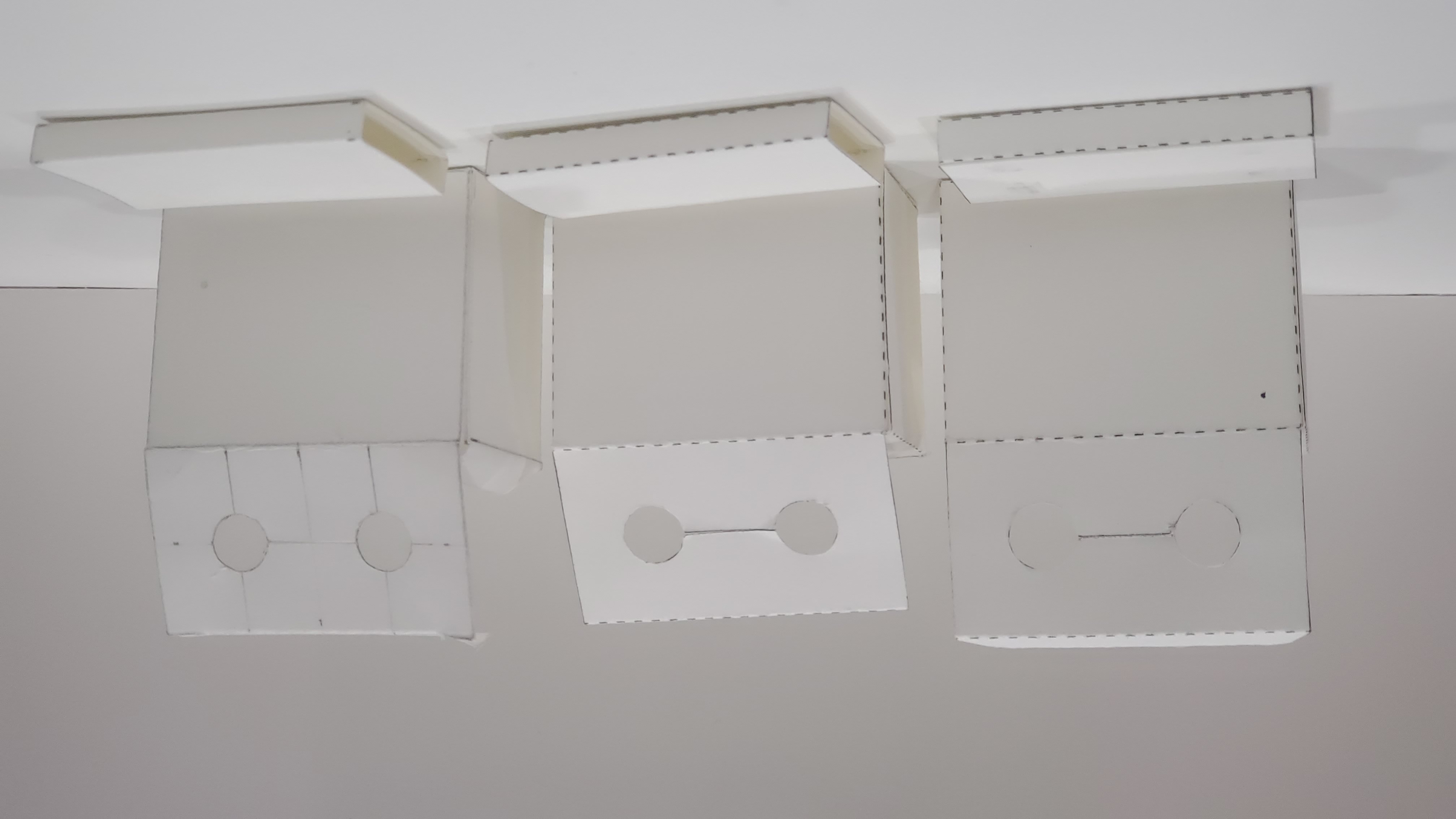
Dielines and Mockups
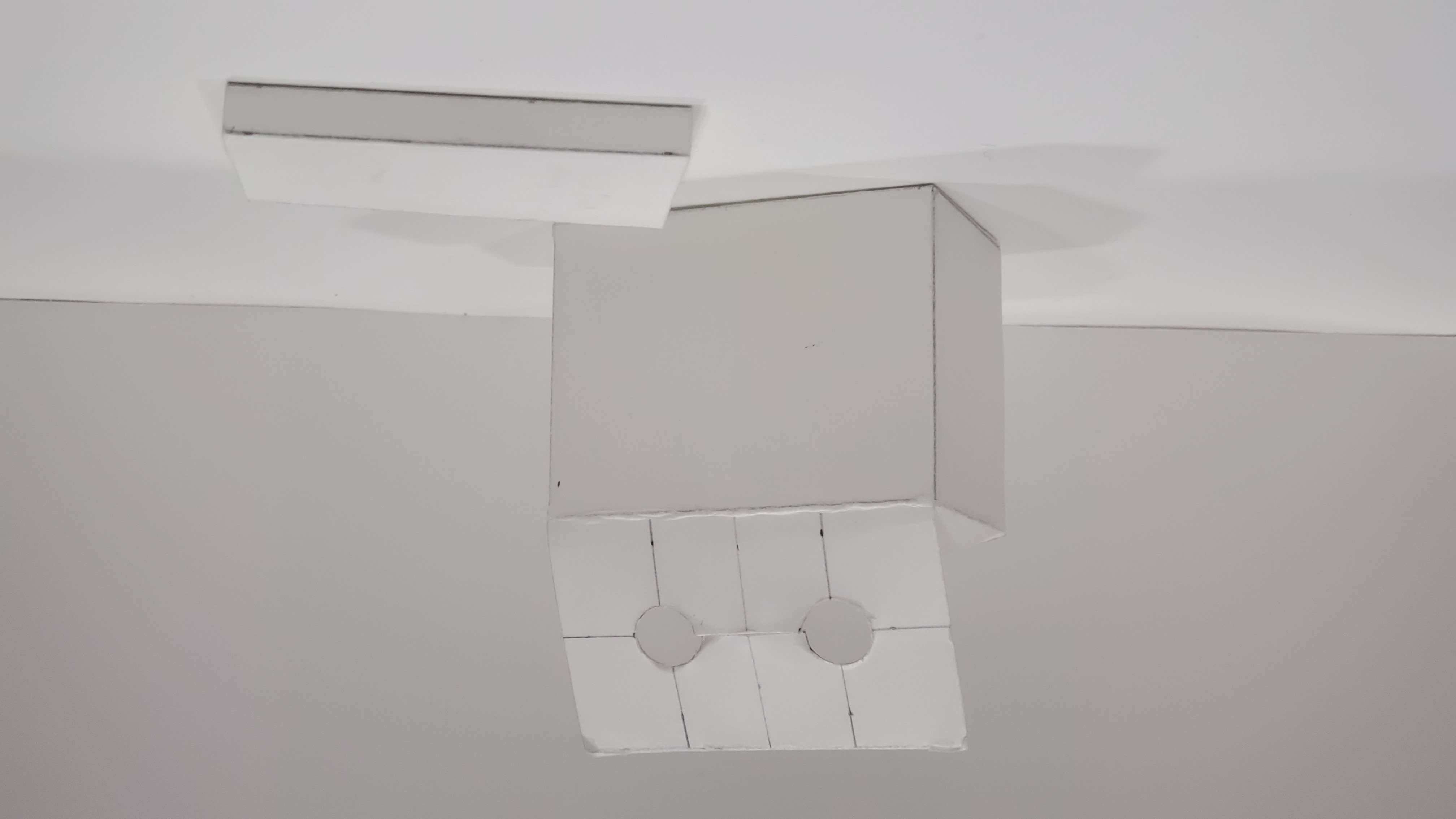
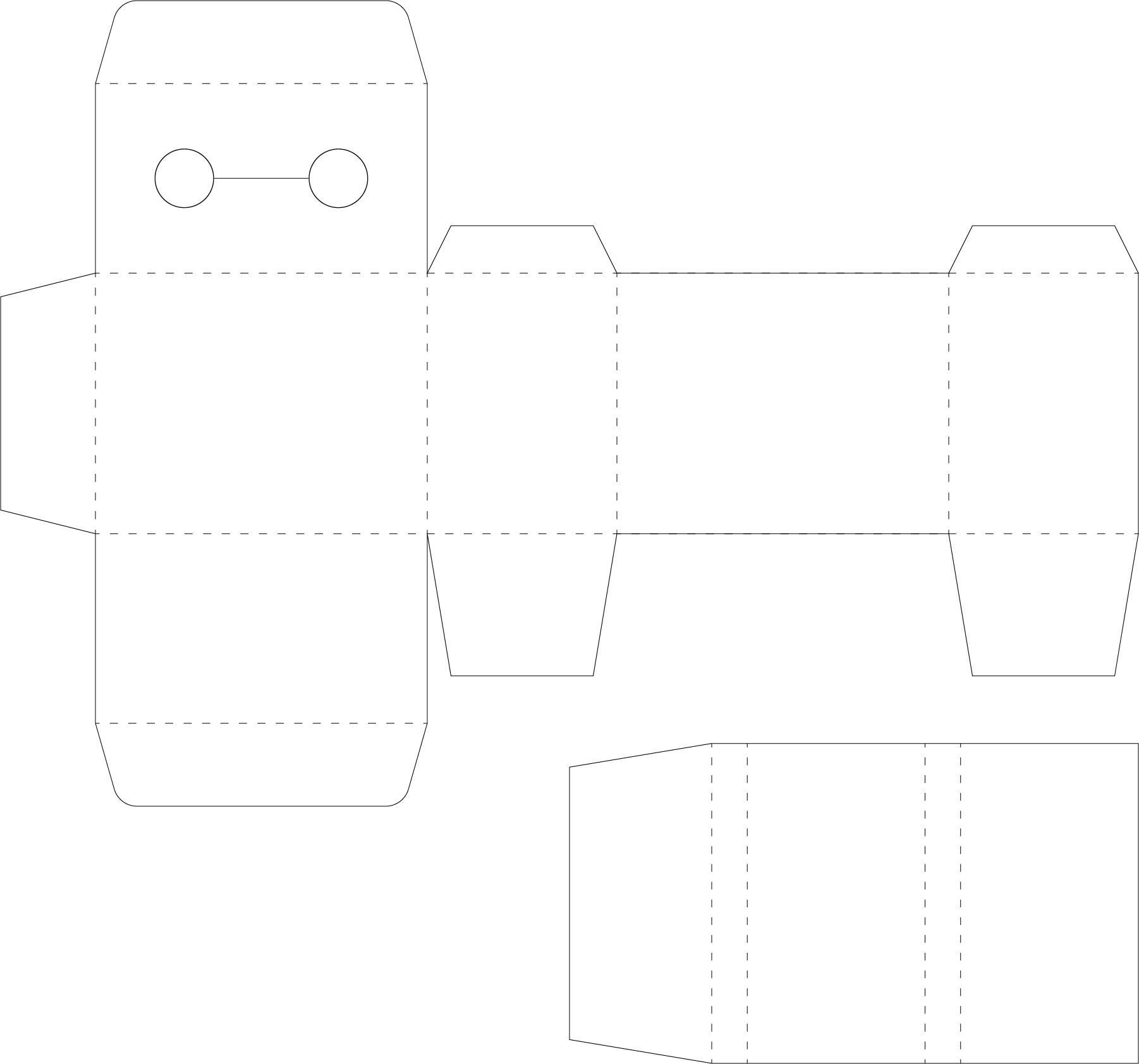
After deciding on the concept for my packaging, my next task was to create a mockup to test the concept. Creating a mockup the box and the sleeve was a relatively simple task and it had a solid structure with adequate space to use for the design aspect of the project. From this point, I needed to create some dielines of the box and another mock up using that newly created dieline. This was another relatively simple task as I created the dielines in Adobe Illustrator, carefully utilizing rulers and guides to create accurate dielines and mockups of my concept. During this process, I found out I could print two boxes and sleeves on one 8.5” x 11” piece of paper.
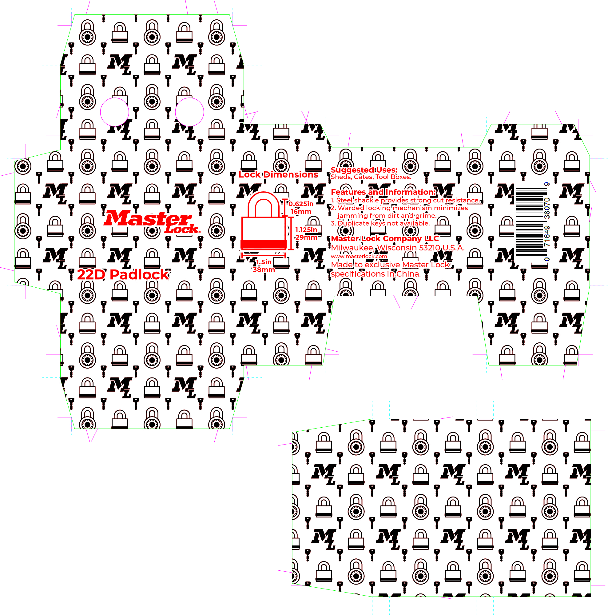
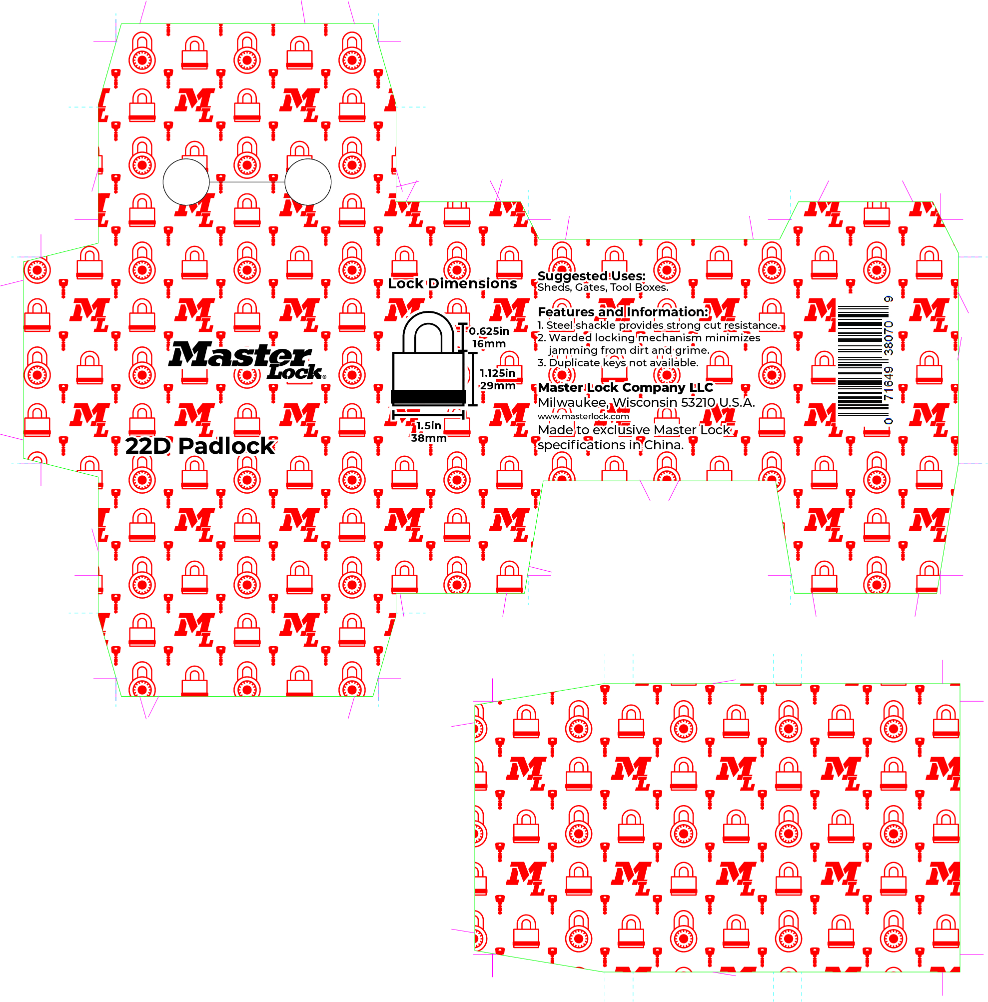
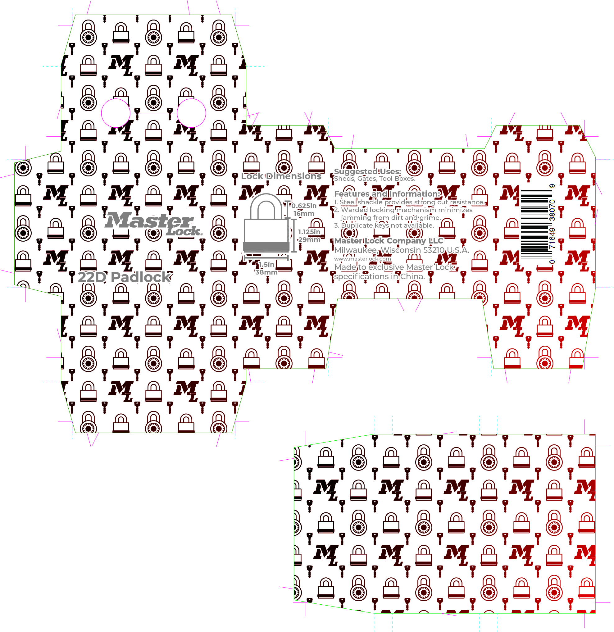
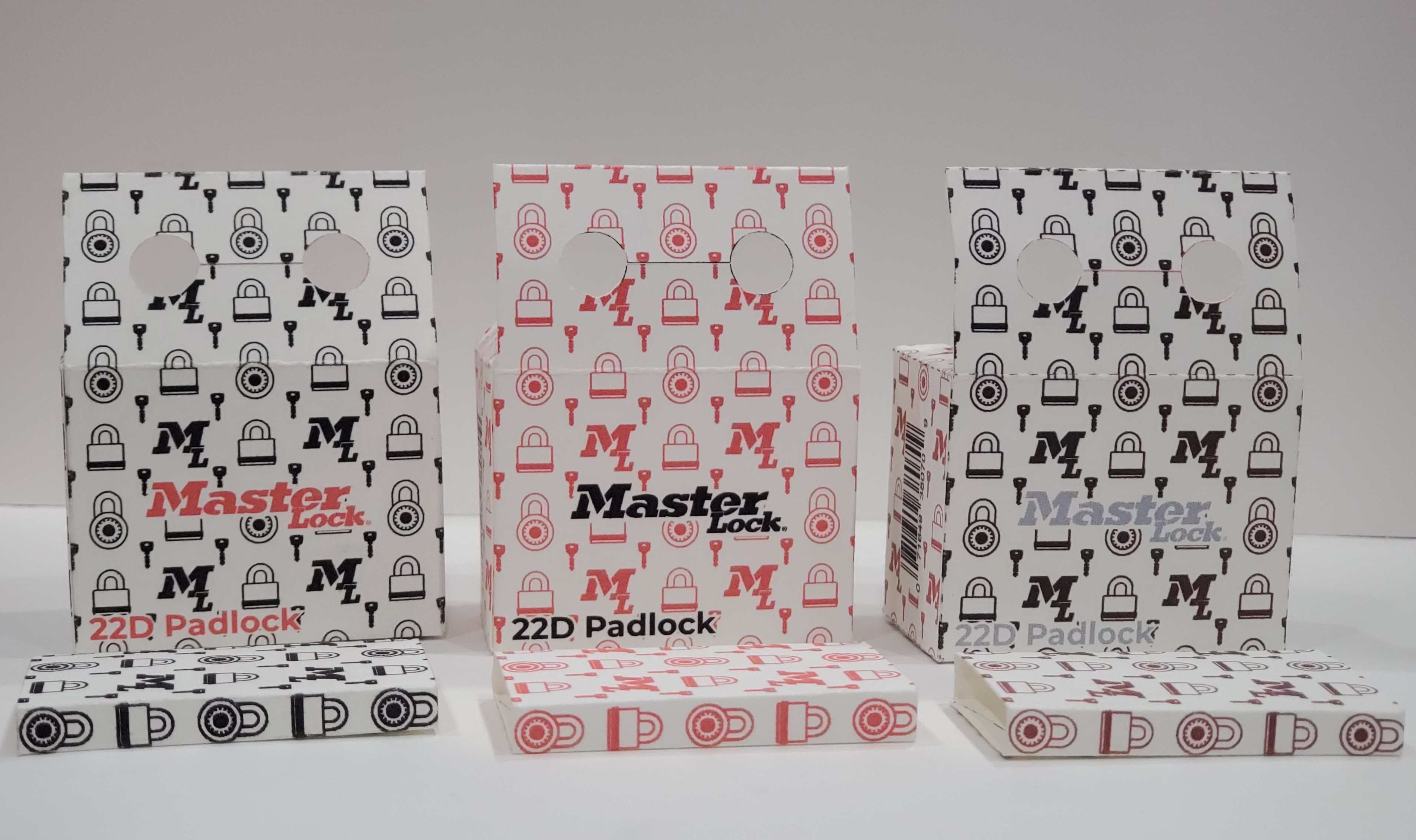
Design the Packaging
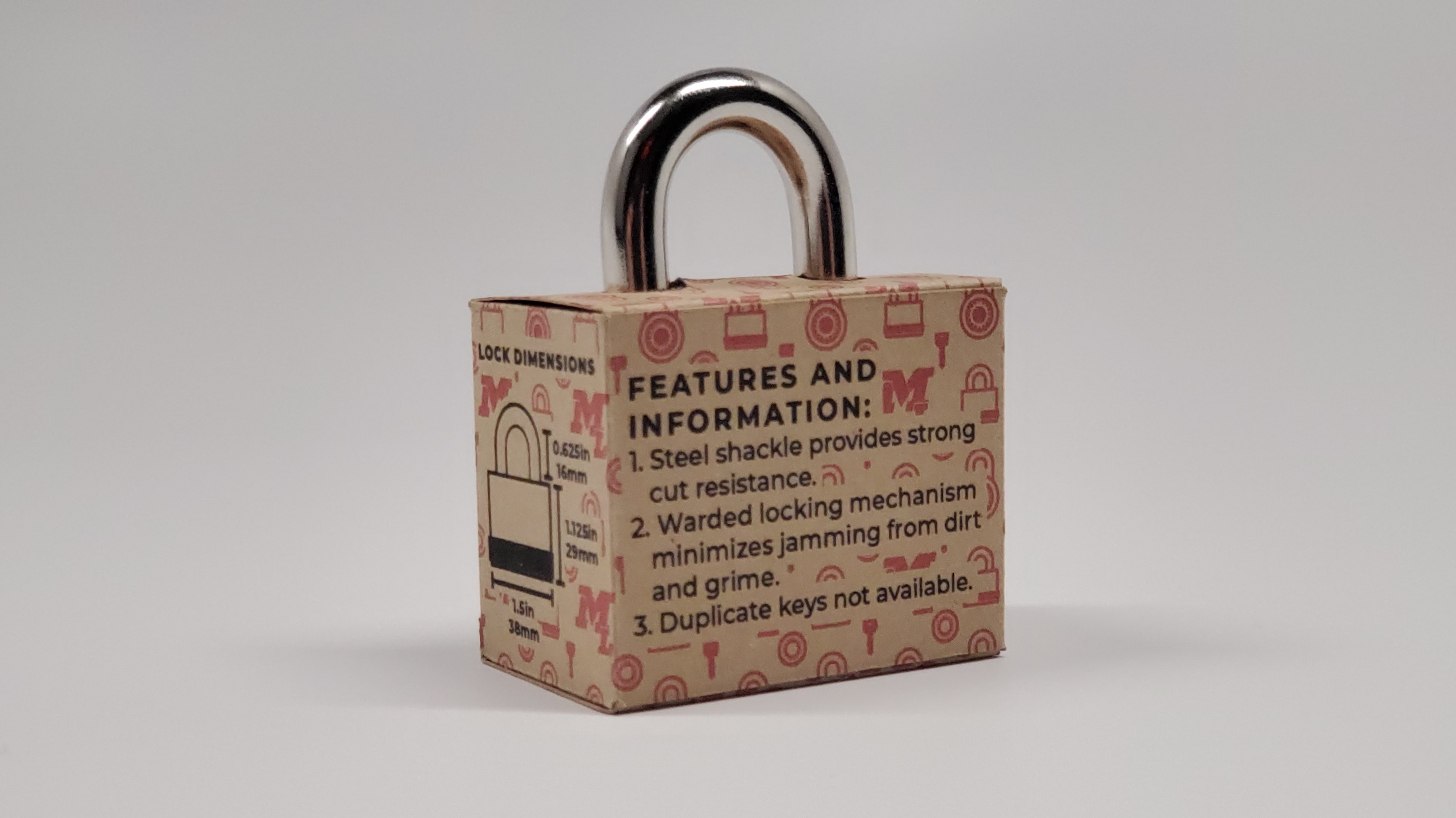
Once my initial dielines were created, it was time to start working on the design of the box. This was the most involved part of the project, as we were allowed to go in any direction we chose. I initially came up with three color variations of the pattern: black, red, and a black-to-red gradient. Each week, I would add more information to the box and adjust the design, creating several mockups to ensure good readability. The gradient version of the design was the least successful due to poor readability and the colors becoming muddy when printed. The black pattern looked great, but the red text was difficult to read. The red pattern also looked good, and the black text was the easiest to read. So the decision was made to use the red pattern with black text on the box and the black pattern on the key sleeve for the final design.